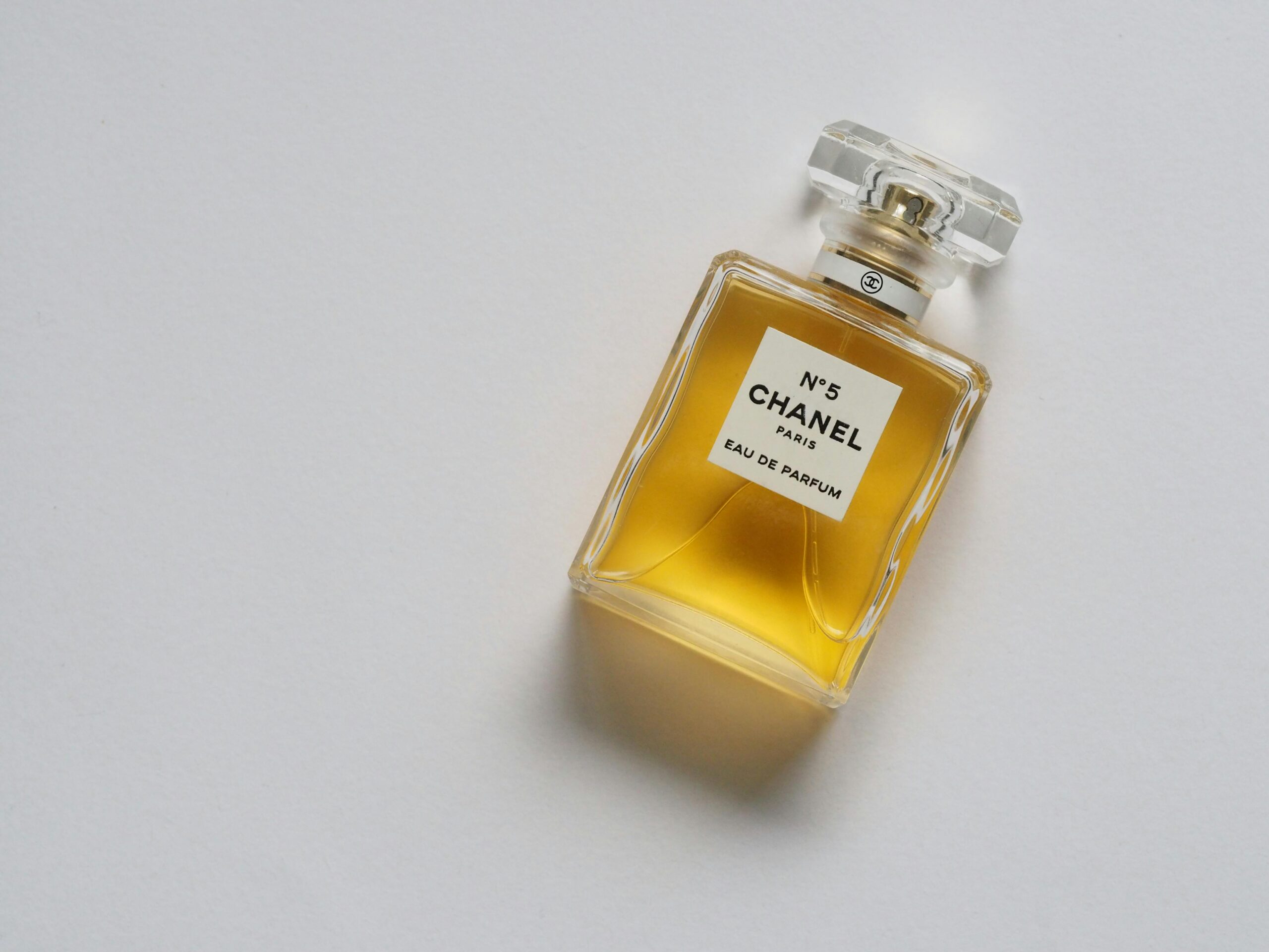
Have you ever wondered how colors influence your buying decisions? From the excitement of red to the calm of blue, colors play a huge role in how we perceive products and brands. This article breaks down the science of color psychology in marketing, showing how different hues can affect impulse purchases, perceived value, brand trust, and more. Color psychology drives consumer behavior, bright hues like red trigger impulse buys, while blue prompts thoughtful decisions. Consistency in brand color enhances recognition and loyalty. Cultural and demographic factors influence color preferences.Using colors strategically in marketing can significantly influence consumer behavior. However, it's important to consider cultural nuances and personal preferences to connect effectively with your audience.
The Science Behind Color Perception
Understanding how we see colors is pretty fascinating. It starts when light hits our eyes and triggers special cells, leading to our brain figuring out the color. Let's break it down into simpler parts.
The Retina and Photoreceptors
Inside our eyes, we have a part called the retina, which has two types of cells - rods and cones. Rods help us see when it's dark or in low light, mainly noticing how bright or dark something is. Cones are the ones that let us see colors, and they work best in bright light. We have three kinds of cones, each picking up on different light wavelengths, which is how we see all the colors around us.
Opponent Process Theory
After light hits the cones, our brain specially processes these signals. It pairs up colors - red with green and blue with yellow - but only activates one color in each pair at a time. This helps us see colors consistently and notice when they stand out against each other.
The Visual Cortex
The signals from our eyes then travel to a part of the brain called the visual cortex, which is in charge of making sense of what we see, including colors. This area of the brain sorts out details like shape, size, and yes, color. Then, other parts of the brain step in to add more context, like movement and depth.
Top-Down Effects
But seeing colors isn't just about the signals from our eyes. Our brain also uses memories and what we've learned about colors in the past to interpret what we're seeing. This means our experiences can change how we perceive colors.In short, seeing colors involves a mix of cells in our eyes picking up light, our brain processing these signals, and our memories and experiences. This complex process lets us enjoy a world full of colors.
Color Psychology and Brand Recognition

Color is super important when it comes to how we think about different brands and how easily we remember them. Studies have found that using the same colors all the time can make us 80% more likely to remember a brand.
The Impact of Color on Brand Perception
Different colors make us feel different things, and this affects how we see brands:
- Blue makes us think of trust and reliability. Big names like Facebook and Samsung use blue to make us feel like we can count on them.
- Red is all about excitement and action. YouTube and Netflix use red to grab our attention and make their brands feel lively.
- Green suggests something is healthy or good for the planet. Spotify and Whole Foods use green to show they care about these things.
- Orange is seen as fun and budget-friendly. Nickelodeon and Home Depot use orange to seem approachable and creative.
Consistent Colors Strengthen Brand Recognition
Consistent color usage across brand elements, such as logos, websites, and packaging, aids in brand recall. For instance, Tiffany & Co.'s iconic blue boxes are instantly recognizable, as are Cadbury's purple wrappers. This illustrates the potency of color in brand identity.
Optimizing Colors for Cultural Relevance
Color symbolism varies across cultures, requiring brands to select hues carefully for different regions. In China, red symbolizes luck, leading brands like KFC and Coca-Cola to incorporate it into their branding for a positive association. Adapting to cultural perceptions ensures brands resonate universally, underscoring the significance of strategic color choices in making a memorable impact.
Emotional and Behavioral Responses to Colors
Colors psychology can make us feel and act in certain ways. Here's what studies say about different colors:
Warm Colors
Red - Makes us feel excited, passionate, and sometimes alerts us to danger or something urgent. It can make our heart beat faster and breathe quicker. Shops use it in big sales to get us to buy quickly.Yellow - Makes us happy, hopeful, and warm inside. It's really good at catching our eye. You'll see it a lot in stuff for kids.Orange - Gives off a vibe of being affordable, creative, and friendly. It's great for highlighting deals or special offers.
Cool Colors
Blue - Makes us feel calm, safe, and trusting. That's why you see it a lot on social media and with banks.Green - Makes us think of nature, health, and fresh starts. It's the go-to color for anything organic or eco-friendly.Purple - Feels fancy, spiritual, and sometimes makes us think of the past. It's often used for products that fight aging or bring back memories.
Influencing Decisions
Colors can push us towards making a decision depending on the situation:Value perception - Using gold or black on packaging makes things seem more valuable and high-quality. Bright colors usually mean something's on sale.Purchasing intent - Cool colors make us stop and think before we buy. Warm colors can make us want to buy something right away.Brand connections - Keeping the same color theme helps us recognize and stick with a brand.But, what a color means can change depending on where you are in the world. It's super important to do your homework before taking your brand global. In the end, using colors in a smart way can really change how people feel about buying something.
Color Preferences Across Demographics
Color likes and dislikes can change a lot depending on things like how old someone is, whether they're a man or woman, and where they come from.It's super important for people who sell things to understand these differences so they can connect better with the people they're trying to reach.
Age Differences
Color preferences vary by age, influencing consumer perceptions and brand strategies. Children prefer vibrant hues, while teens opt for energetic colors.Middle-aged adults favor sophisticated tones, and seniors prefer serene shades. Understanding these preferences helps brands tailor offerings effectively.As we get older, we tend to move from loving bright, warm colors to preferring softer, cooler ones. Brands need to think about this when they're trying to reach people of different ages.
Gender Differences
It turns out women and men often see colors differently. Women usually notice more shades and prefer softer, warmer colors like red, yellow, and green. Men tend to like stronger, cooler colors like blue, black, and gray.This affects how companies market to each gender. Beauty and fashion brands for women use more pinks, purples, and natural colors. Products for men often come in navy blue, dark green, black, and shiny colors like silver and gold.
Cultural Differences
Color meanings vary globally. For instance, white symbolizes purity in the West but mourning in India. Red signifies luck in China but danger in Western cultures. Brands selling internationally must consider local color perceptions to make a positive impact. Collaborating with local designers ensures color choices resonate with each market. Ultimately, understanding demographics and cultural contexts is crucial for effective branding and advertising.
Practical Applications in Marketing and Branding
Colors can really change how we think and feel about a brand. Here are some simple ways businesses can use colors to connect better with people:
Brand Identity and Messaging
Pick colors that show what your brand is all about. For instance, blue and green are great for showing trust and a connection to nature. Make sure your logo, website, and packages all use the same colors. This helps people remember your brand better.
Product Design
Use different colors to tell products apart. Like how Tiffany's has those special blue boxes. For extra context, bright colors for cheaper items and black or gold for fancy stuff can make people think they're getting a good deal or something nice.
Advertising and Marketing
Choose colors that your audience likes. Young people love bright colors, while older folks might prefer softer shades, and use colors that stand out together for ads to be more noticeable and easy to remember. Yellow and black or purple and orange are good pairs.
Retail Spaces and Visual Merchandising
Bright, warm colors in busy areas can make shopping more fun and encourage people to look around more. Cool colors like blue or green in changing rooms can make shopping more relaxing.Understanding color psychology can help businesses make better branding choices, improve sales, and grow. Always keep testing and changing colors based on who you're trying to reach and what you want to achieve.
Challenges and Limitations
Color psychology is useful, but it's not always straightforward. Here's why:
Cultural Differences
Colors don't mean the same thing everywhere. For instance:
- In China, red is a lucky color, but in many Western countries, it means danger.
- White is for weddings in the West but is worn at funerals in India.
- Green makes Americans think of nature, but in Malaysia, it might remind people of poison.
For companies selling products around the world, understanding local color meanings is key. If they don't, their products might not hit the mark.
Individual Differences
Everyone sees colors a bit differently because of their own experiences:
- Kids love bright colors, but older folks might prefer softer shades.
- Women often like softer colors than men do.
- Your background can change how you see a color. For example, red is exciting for some but relaxing for others.
- Where you live matters too. People from sunny places might love yellow more than those from cloudy areas.
Companies should talk to their customers to find out what colors they really like.
Situational Influences
Where and how you see a color can change how you feel about it:
- Red on lipstick feels different than red on a stop sign.
- Wearing black to a funeral isn't the same as wearing it to a party.
- Blue lights can be calming in a spa but feel cold in a nightclub.
The same color can make us feel different things depending on the situation. Brands need to think about this when picking colors.
Design Complexities
How colors look can change based on what's around them:
- Red next to grey looks brighter than red next to green.
- Rough textures can make colors look less bright, but smooth textures can make them pop.
- Sharp shapes can make colors look more intense than rounded shapes.
- Colors at the top of a page feel heavier than colors at the bottom.
These little details make it hard to say for sure how a color will work. Brands need to keep testing to see what works best.In short, while color tips are great, they need to be tested in real life. Brands have to really know their audience and how different things can change the way colors are seen.
Conclusion
Understanding color psychology is vital for grasping its influence on consumer behavior. From evoking emotions to shaping perceptions, colors wield significant power in marketing. Remember that bright hues like red can spur impulse buys, while blue fosters a sense of trust and reliability. Consistent use of colors across brand elements enhances recognition and loyalty. However, cultural nuances and individual preferences must be considered when employing color strategies globally. Despite its complexities, harnessing color psychology effectively can profoundly impact brand success and consumer engagement.
Related Posts:
Turn color into conversions with Floowi talent
Interview for free


.png)


